Print files9 min read
How to Fix a Pixelated Logo for Printing: Upscaling vs Vectorizing
“It looks fine on my phone, but the printer says it’s too blurry.” Why that happens, the four ways to fix it, and what a real 300-pixel logo looks like upscaled and vectorized, side by side.
Key takeaways
- A logo pixelates in print when the file has too few pixels for the printed size: printed 30 cm wide, a logo 300 pixels across has pixels about 1 mm wide.
- Look for the original vector file first (AI, EPS, PDF or SVG from whoever designed the logo). It beats any repair.
- Upscaling adds estimated pixels, so the file is still pixels and gains no real detail. Vectorizing redraws the shapes as paths that stay sharp at any size.
- In our test, VKTR turned a 300 × 180 px JPEG into clean vector shapes, but thin serifs and small letters came out thicker and misshapen: check lettering, colours and size before you print.
A logo looks pixelated in print when the file has too few pixels for the printed size. Changing the DPI or saving it as a PDF doesn’t fix that. The real fixes, in order: find the original vector file, find a larger copy, upscale it if it only needs to grow a little, or vectorize it, then check the result before it goes to print.
Why a logo becomes pixelated when it is enlarged
PNG and JPG files are raster images: a grid of coloured pixels, fixed when the file was made. On a phone, a 300-pixel logo fills a few centimetres of screen and looks sharp. On a banner or a sign, the same 300 pixels are spread across a much larger area, so each one shows as a soft blur or a small square step.
The arithmetic is simple. Printed 30 cm wide, a logo 300 pixels across gives each pixel about 1 mm. As Adobe’s Photoshop help puts it, when the print size goes up without adding pixels, the same pixels are spread across a larger area.
JPEG compression makes it worse. A JPEG saved small or at low quality adds blocks and coloured halos around sharp edges, and enlarging the image makes those visible too. If the size is fine but the file is dirty, with specks, pale fringes or colours that drifted, see how to clean up a logo.
A vector logo works differently: it stores shapes as paths, so the design app or printer draws the edges fresh at whatever size is needed. That is why the usual fix for a logo is a vector file, not a bigger JPG. Our guide to what a vector file is shows how to tell which kind you have.
First, look for the original file
Before repairing a poor copy, check whether a better one exists. Tracing a 300-pixel JPEG is the last resort, not the first.
- Ask whoever designed the logo. Designers and agencies often keep the working file: AI, EPS, PDF or SVG.
- Search old emails and shared drives for brand files, a brand guidelines PDF, or the files sent to a printer for an earlier job.
- Ask the printer who printed it last. A print shop may still have the file from a previous order.
- Check your website. If the site shows the logo as an .svg file, that file may already be vector: open it and check it is made of paths, not an embedded picture (why an SVG may not be editable).
Be careful with files that only look like vectors. A PDF or an SVG can hold a pixel image inside it, and renaming a JPG to .svg changes nothing.
Upscale or vectorize? Four ways to fix a pixelated logo
If no original exists, there are four options. They are not equally good for every logo.
| Option | What it does | Suits | Watch out for |
|---|---|---|---|
| A better source image | Uses a larger, sharper copy of the same logo | Any logo, if a bigger copy exists | A screenshot or a forwarded copy may have been shrunk along the way |
| Raster upscaling | Adds estimated pixels to make the image larger, with standard resampling or an AI upscaler | Photos, and logos that only need to grow a little | It can’t add detail that wasn’t there, the file is still pixels, and an AI upscaler may reshape small letters |
| Automatic vectorization | Traces the shapes into vector paths | Logos, icons and flat-colour artwork with clear shapes | Thin lines, small lettering and soft edges need checking, and sometimes correcting |
| Manual reconstruction | A designer redraws the logo as vectors, using the copy as a guide | Tiny or damaged copies, and lettering that must match a brand typeface exactly | It takes a designer’s time: usually the slowest and most expensive option |
For most flat logos, vectorizing gives the most for the least effort, and a good vector can then be printed at any size. For photographs, upscaling is the right tool: tracing a photo turns it into stylised artwork, not a sharper photo. What each option costs is in how much it costs to vectorize a logo.
A real test: one 300-pixel logo, upscaled and vectorized
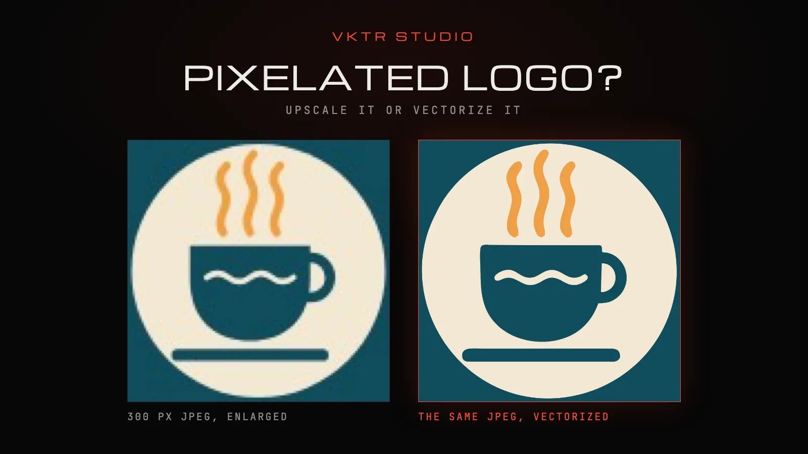
To show the difference honestly, we started from a logo we have as a true vector original: Tidewater Coffee Roasters, a made-up brand from VKTR’s own test set. We saved it the way a logo often reaches a printer, as a small JPEG: 300 × 180 pixels, quality 70, 10 KB.

Then we did two things with the same file:
- Upscaled it 8 times, to 2,400 × 1,440 pixels, with standard smooth resampling in macOS, as any app does when you make an image bigger.
- Vectorized it in VKTR Studio with the automatic settings. Because the image is small, the Studio first cleaned up the JPEG compression and enlarged it 2× before tracing; its input line read “JPEG · Cleaned up · 2×”.
We drew the vector at the same 2,400-pixel width and compared both with the original artwork.
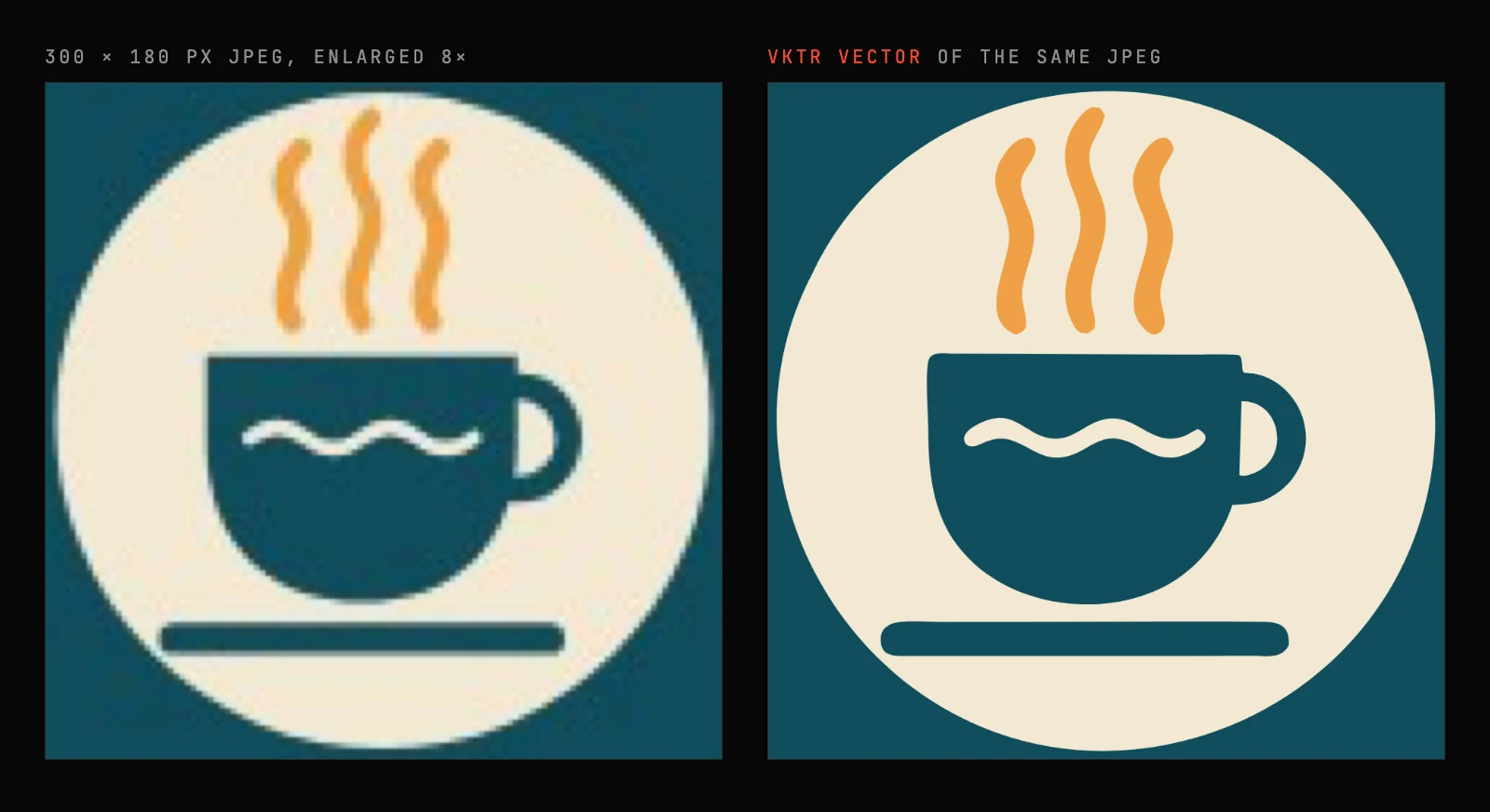
What vectorizing fixed. The circle, cup, saucer and steam came out as smooth, sharp shapes in the right colours. The result had 35 paths in 7 layers (the background, the circle, one object and four text groups) and no embedded image, so it scales to any size without blur.
What it couldn’t recover. The 300-pixel file had already lost detail, and no tracer can put it back:
- The thin hairlines and serifs of the TIDEWATER wordmark came out thicker and slightly wobbly.
- The small COFFEE ROASTERS letters, about 6 pixels tall in the source, came out readable but misshapen: the R and S are lumpy.
- The thin rule and the small lettering came out a duller gold (#D6AB61) instead of the original orange (#F2A03D). In a small file, those thin shapes are mostly edge pixels blended with the teal background.
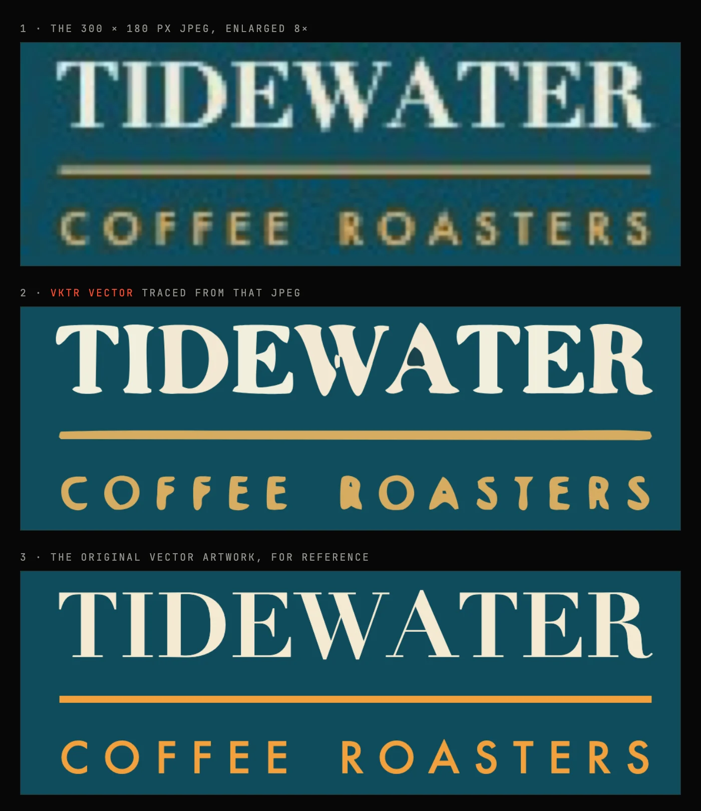
The colour is quick to correct in the Studio: select the lettering and the rule, and recolour them to the brand orange. The letter shapes need a designer: set the words again in the brand’s typeface, or redraw them, using the vector as a guide. VKTR’s editable-text tool only swaps lettering for one of five common fonts (Arial, Georgia, Times New Roman, Courier New and Verdana), so it can’t restore a brand typeface like this one.
The test shows the general rule: vectorizing removes the blur and gives you a file that scales, but it traces what the pixels show. The smaller the source, the more the small details need checking.
What vectorizing can’t fix on its own
- Small lettering: letters only a few pixels tall come out approximate.
- Thin lines and serifs: hairlines only a pixel or two wide thicken, wobble or break.
- Uncertain edges: blur, JPEG blocks and shadows make the tracer guess where a shape ends.
- Gradients and soft shadows: VKTR can keep smooth colour ramps as gradient fills, but a blurred, compressed gradient may come out as steps.
- Missing details: anything the small copy lost, such as a ® mark or a fine texture, can’t be traced back; it has to be redrawn.
If the logo must match the brand exactly, on signage or packaging for example, have a designer rebuild the parts that came out wrong. The vector still saves time: it gives them accurate shapes and positions to start from.
Check before printing
Whichever fix you use, check the file at full size before it goes to print:
- Letter shapes and spacing: compare every letter with the original, and look for joined letters and filled-in gaps.
- Colours: check them against the brand colours, especially thin lines and small text.
- Dimensions: set the width the job needs; the Studio’s download panel sets it in millimetres.
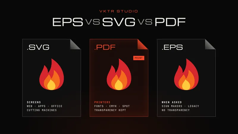
- Format: send what the printer asks for: a PDF for most printers, EPS when a sign maker asks for it, DXF or SVG for cutters and lasers. EPS vs SVG vs PDF explains the differences.
- An open file: if the printer asked for an editable or “open” file, see what to send.
How a print studio uses this
Sun Studio, a UV printing studio in Dubai in the same group as VKTR, uses VKTR Pro, the unlimited plan (called Enterprise when it subscribed), to turn suitable customer images into editable vector artwork for printing. Its team started with four trial files, then a call and a demonstration, before subscribing, and it prepares production layers, masks and material settings after the conversion. The Sun Studio story shows the workflow.
For the conversion itself, step by step, see how to convert PNG or JPG to editable SVG, or start from the logo to vector converter.
Questions about pixelated logos
- Does changing the DPI fix a pixelated logo?
- No. Changing the resolution (DPI or PPI) without resampling only changes how large the same pixels print. With resampling, the software estimates new pixels. Neither adds detail the image never had, as Adobe’s Photoshop help explains.
- Does saving a JPG as a PDF make it a vector?
- No. A PDF can hold a picture, and a JPG saved as a PDF stays pixels inside the PDF. To get vector artwork, the logo has to be traced or redrawn as paths.
- Is it better to upscale or vectorize a logo?
- For a logo with flat colours and clear shapes, vectorizing is usually better: the result is paths that stay sharp at any size. Upscaling suits photographs, or a logo that only needs to grow a little, because the result is still pixels.
- Can an AI upscaler fix a blurry logo for printing?
- It can make a raster logo look smoother at a larger size, but the file is still pixels and the extra detail is estimated, so small letters can change shape. For a logo that has to print large, a vector file is the safer choice.
- When is manual redrawing needed?
- When the source is too small or damaged to show the shapes clearly, when lettering must match the brand typeface exactly, or when a traced result still has misshapen letters or lines after you have checked it.
- How small is too small to vectorize?
- There is no fixed limit; what matters is whether the shapes are clear. VKTR enlarges a small image before tracing, but it can’t recover detail the file lost. In our test, a 300 × 180 px JPEG gave clean shapes, while lettering about 6 pixels tall came out misshapen.
- Is the vectorized logo ready to print?
- Not automatically. VKTR gives you editable vector artwork, not a guaranteed print file. Check the lettering, colours and size, and send the format your printer asks for.
- Is VKTR free to try?
- Yes. Converting, previewing and editing are free with no account. Each download uses one credit, and every free account gets 2 credits a day.